|
History
HDR imaging, also called HDRI, was invented by Paul Debevec. The idea behind it is that a computer image can contain a larger range of light intensities than can be displayed on a computer screen. The human eye adjusts for differences in brightness in various ways automatically, but photographic devices have traditionally always had ways of adjusting the amount of light that is registered, so that the medium on which it is recorded contains the most wanted range of light. An under- or overexposed photograph using normal film cameras means that the information that was wanted has been lost. In a HDR image, however, the full range (gamma) of light is present. One can then use software to adjust the range of light that is displayed, usually with exposure, black and white point controls. Advanced image adjustments can be done using techniques that are generally referred to as 'tone mapping', which is not unlike using the curves tool in photoshop but then on HDR images. Thus, rendering to HDR you can re-adjust a render that was too bright or too dark without re-rendering. And that is just one of its many advantages. In this tutorial we will use both standard re-exposure techniques as well as a specific type of tone-mapping using virtual darkroom, an image filter plugin that comes standard with LightWave.
Another good resource is the original Virtual Darkroom creator Rob Gougher's page on it. It is rather outdated though, and the interface is different, but it's basically the same.
Color space
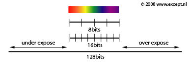
Those familiar with chemical film know that a high quality slide film contains more information than a normal 8-bit image can contain. Good scanners therefore are able to adjust exposure as well as scan in 16 bits. This basically doubles the dynamic range of an image by giving each pixel a color space of not 256 green + 256 blue + 256 red (8 bit per channel) but 32,769 green + 32,769 blue + 32,769 red (it's actually 15 bit since the last bit is used for other stuff). However 16 bit images do not really expand the dynamic range of images, they just refine the steps in between. this poses a problem when wanting to expand beyond the default visual range of n aimage. With true HDR imaging the range is expanded to comprehend the full light spectrum. This results in a 128 bit image. Typical image formats that are able to store this information are .HDR (radiance, the original format), OpenEXR, FLX (Newtek's format) and Tiff. Of these, OpenEXR is by far the most flexible and powerful. LightWave can load and save all of these formats natively, but for super-expanded OpenEXR functionality there is a great plugin available from db&w.
 |
HDR imaging created various uses and techniques that changed the way we use 3D software. One of the most important ones was HDR based lighting. This essentially means using a HDR image to illuminate a scene to mimic the exact lighting conditions when the HDR image was recorded. HDR images are made by combining several photographs taken with different lighting conditions and combined into one. You can make your own HDR images using photoshop or more advanced HDR software. Debevec's website is a good resource for this.
Projection types
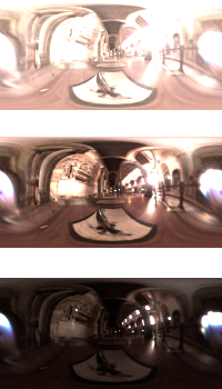
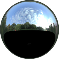
To accommodate these various uses different projection types were implemented for specific HDR images. They are basically the same issues as trying to map a globe onto a flat surface, and there is no ideal way to do it. Currently the most popular format for this is the lightprobe projection, which is basically an image which looks like a photograph of a chrome ball. It contains all information of an entire spherical skydome in a single image, but with different resolutions for different areas. In this tutorial we will not be bothered by light probe maps too much since we won't be using HDRs to light our scene, but instead use HDRs as our output format after which we are able to adjust the image in this range to get much more realistic, atmospheric and controlled looking images or footage. I'll only be using techniques that allow themselves to be animated. |
One HDR image at different exposures, with latitude-longitude projection.
Hugo Wolf Lightprobe HDR
(get some here)
 |
|
| Surface and Lighting requirements |
Using an HDR workflow goes beyond the mere rendering to another image format and messing with it afterwards. To get really good images your lighting, rendering and surfacing setup will all conspire to produce the desired output. There are various words for this but it is usually called a 'linear gamma workflow'.
The thick of it
Before you make your renders you should start to get familiar with this linear workflow. This is not easy if you are unfamiliar with it, and I won't cover the whole range of necessities for this, just the basics. You have to imagine what happens in the real world. A light source sends photons out and they are then bounced off surfaces and caught by our eye or the camera before we are aware of the light. A light source in pitch darkness with nothing to reflect on is still darkness. The light is therefore important, but the surfaces much more so. First, we need to understand that normal materials do not generate light, they only bounce back whatever light falls onto them. A red object with white light falling onto it doesn't radiate red light, but its surface absorbs all light frequencies except for red light. This red light is then bounced back and is thus perceived as red. If this is understood then setting the material properties in LightWave or any other render program becomes a matter of both thinking carefully, adhering to a set of simple rules and perhaps doing a bit of research into how materials respond to light.
The following settings are available for standard materials in LightWave:
| Value |
|
Description |
| |
|
|
| Color |
|
This is the color of the material of the diffuse reflection of light. |
| Luminosity |
|
How much light is generated by the material itself (usually none, except for light bulbs etc) |
| Diffuse |
|
The amount of light that is reflected in a diffuse manner. Color+Diffuse = total diffuse reflectance. So a black color with 100% diffuse is still pitch black, just like a white object with 0% diffuse is pitch black. Rough objects have a high diffuse (rock: 50-70%), and smooth objects a low one (chrome: 0-10%) |
| Specularity |
|
This is an old method of simulating reflection from lights, and works in conjunction with Glossiness. It is a debatable value and for true realism it is best to be avoided. However it is super fast to calculate and can achieve the right effects in many cases. If you do not use specularity, use reflection with the proper amount of reflection blurring to replace specularity and glossiness. |
| Glossiness |
|
This is how 'rough' the specularity will be simulated. Rough materials will have a low glossiness and smooth materials a high one. |
| Reflection |
|
This is true reflection. All materials reflect, which is an important thing to realize in photo realistic rendering. However some material reflect in such a diffuse manner that it's hardly noticeable. Since reflection is a computing-intensive operation it is important to make good decisions about this in order not to create render times that are too long. Use the reflection blurring in the 'environment' tab to set the roughness of the reflection. |
| Transparency |
|
How much light is allowed to pass through the surface. Works in conjunction with the refraction index. |
| Refraction Index |
|
A physical property of materials that can be looked up on the internet for most materials. Here is a nice starting point reference for them. it should be noted that when refraction is anything other than 0 it will invoke LW's refraction operations which are very expensive calculations. Only use when necessary. |
| Translucency |
|
How much light is allowed to shine through an otherwise opaque material. This is basically, like specularity, a fast rendering cheat to simulate Sub Surface Scattering (SSS). However it doesn't work nearly as good. This is used for things like wax, or thin paper with light shining on it from behind. |
| Bump |
|
Bump mapping value, a cheat method to give surfaces a certain 3D texture look. It works extremely well, and if you're reading this, you probably know what it is and I'm not going to spend a long time explaining what it does, because you know it already. I can spend my time better chasing kittens, fishing for squirrels or robbing old ladies. Wouldn't you say so? |
|
The Rules
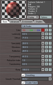
Okay, we know this: surfaces do not emit light (most of them anyway). Looking at the values in the material editor from LightWave we find one of the little gems of how LightWave works: most values are in percentages. Percentages of what, I hear you ask, well, very simple, percentages of light. This means that a diffuse value of 70% will reflect back 70% of the light that is falling on it. And hey, presto, Lw's lights are also measured in percentages. This means that a pure white surface with 100% diffuse with a 100% intensity white light will render as... exactly pure white. However, drop either the light intensity or the diffuse by let's say 20%, the render output will be 80% white.
Looking at the other values we can summon up the values that 'use' light in one way or another. Diffuse bounces it back in a diffuse manner, reflection bounces it back in a reflected way and transparency lets it through. Accepting that surfaces do not generate light we understand that Diffuse + Reflection can never be more than 100%, or light would come from somewhere that doesn't exist. So, when making your materials a very important rule is:
Diffuse % + Reflection % < 100%
As you can see in the first screen shot on the right of the surface editor, adding up these values for this material results in 71.5% + 20.5% = 92.0%, and is thus within the proper parameters... but read on.
The next important rule is that nothing in the real world is perfect. There is no such thing as a perfect vacuum on our planet, and there is no such thing as a perfectly smooth material. The best and most expensive mirror is 97% reflective at most. Most materials, even the most perfect ones, are not 100% diffuse. Most materials cut out at about 75% (a perfectly diffuse white wall). The rest is... reflection and absorption (converted to heat). this means normal materials do not generate light, but they do lose it, due to heat conversion. Thus, this is my personal rule (not exact):
Diffuse % + Reflection % < 70%
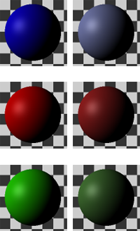
This 'imperfection' of nature also extends to all other values, and in particular to color. There is no such thing as a perfectly red material. It is always impure. therefore, stay away from color choices that are too saturated.
For more easy to set up and physically accurate materials you can also use the energy conserving nodes in the surface node editor. there are quite a few, among which conductor (metal), dielectric (glass), Delta (diffuse materials), and so on. These do all these rules, and far more (such as fresnel) automatically. They look great and are very powerful, but they render slower than standard LightWave materials made using the layer system.
|
LightWave Material Editor
Colors
|
|
| Rendering and saving your image |
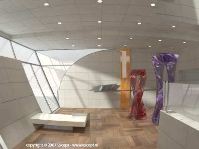
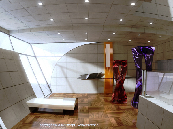
First, we need an image to work with. I am using my scene which is available for free here. I modified it a bit... because I can, and used a spherical camera for a bit of pzazz. I rendered to the image viewer. For pre 9.3.1 LightWave users make sure 'Image viewer FP' is chosen in the render display option in render globals, and not the 'image viewer', since we want the FP (floating point). Post 9.3.1 it is a FP image viewer by default. The image viewer will show that the image is 128 bits (see image on the right).
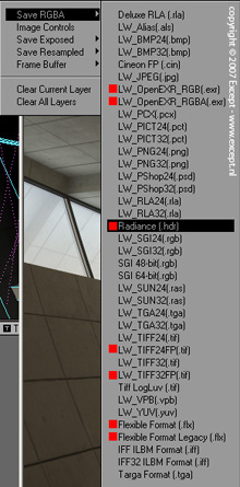
LightWave will always render to HDR, but you will lose the HDR information unless you choose an output format which supports it. On the right an image shows which image formats support HDR in red. I have chosen HDR, just because I'm used to it. It doesn't really matter, but OpenEXR is probably a better choice in the long run.
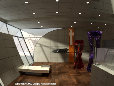
Below a reduced size of the image I will be using. You can download the full image here (2mb HDR).
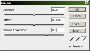
When you open this file in photoshop it will look much lighter than displayed above. This is because an HDR file does not save a gamma setting. This does not alter the data in the file in any way, it is still the same image. To see it the same way it was rendered set the Gamma in the 'exposure' adjustment tool to 0.5. (located under Image > Adjustment > Exposure in PS CS3).
 |
 |
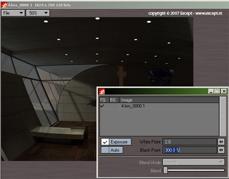
This image has several bright spots, but we can only really see which areas are very bright as compared to others by playing with the exposure options. You can do this in PS but that is not necessary. The image viewer in LightWave has exposure controls built in. Under file > Image controls there is a panel that lets you set the white point and black point. This can be a bit confusing but you'll get used to it soon enough. When you click the 'exposure' tick box the controls become available. The white point is set to 1.0 by default. Lowering this value ramps up the bright areas in your image, and raising the value darkens the bright areas. The black point works identical but is a percentage. The image below shows me checking the bright areas in the image by setting the white point to 2.0 and the black point to 300%.
We can see that the brightest areas are the spots in the ceiling. That's fine. This is a nice image to play around with. On to the next section! |
Image Viewer detail
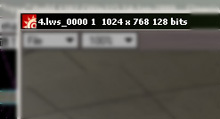
Image viewer saving options
|
|
| Re-opening and adjustment in the image editor |
The image editor in LightWave is a very powerful tool that doesn't receive the attention that it deserves. You can do quite advanced things in it, and all the image filters are available to you. Here is the place where we will test and set up the adjustments for our image sequence or image. For an image we can then simply save it out directly from the image viewer, or for sequences we put it in the background in the compositing panel, and render out our image sequence.
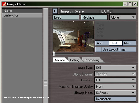
First, load up the image in the image editor (you do not need to clear the scene, you can do all this while you have any random project open for single images).
As you can see, the image is loaded in, and it is a still. So far so good. One of the handy things about the image editor is that you can double-click on the image name or on the preview area and it pops up an image viewer with the full resolution in 128 bits, including all the adjustments that you have made. This is a fast way to save out, experiment with exposure and check the image in full. Remember that when doing exposure in the image viewer, and you are saving out to a non-HDR image format you'll have to use the 'Save exposed' function instead of the standard save function.
So, we'll do this and adjust the image using the image controls in the image viewer until we get an image that is to our liking. I think standard this image is a bit dark, so I'm going to ramp up the intensity of it a little bit...
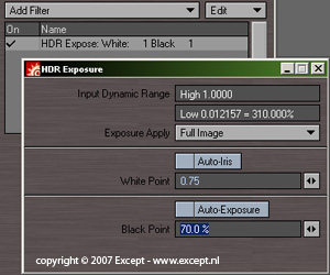
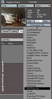
I chose to set it to a white point of 0.75 and a black point of 70%. Nice and bright. I want to keep this setting for the rest of the process so I add a permanent HDr adjustment to the image as follows:
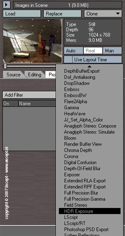
In the processing tab of the image editor add an 'HDR Expose' image filter.
Here we enter the values we found while experimenting in the image viewer. They're now applied to the image and we can continue doing other stuff to it. The preview will update with the brighter image, and if you double click it you get an image viewer with the HDR Exposure filter applied. Nice, huh?
One of the things you'll notice is the aliasing around the white spots. this is typical of HDR images and is nearly impossible to remove. In the real world both the eye and cameras would 'bloom' or 'corona' at this point, which is a bright blurry bloomy area around these hot spots. We'll be simulating this first.
|
Adding the HDR Expose
Image filter
(click for enlargement)
|
|
| Adding Bloom to the image |
Bloom is one of those freebie techniques that most people forget, and is so nice and powerful and easy to use. It's one way to get rid of that sharp CG look that many renders have, and give this nice glow to bright areas. Also, it is a natural phenomenon that happens all the time and our eye is used to it, so if it's missing, images seem just 'not right'. You can do this in photoshop by wielding a white airbrush, which is a good way to do it for images, but for a 3 minute animation? No thank you.
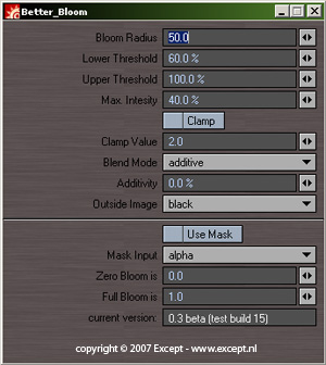
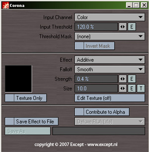
We have two image filters available to us in standard LightWave which are adequate for most applications. They are 'Corona' and 'Bloom'. The difference is that corona is a very exact and complex filter that can do a lot of things, while bloom is a one-shot affair. The problem is that Corona can be very slow. I therefore use a free plugin called 'Better Bloom', made by Matthias Wein. Don't you love the LightWave community?
I usually prefer Better Bloom over corona purely because of speed. For very special things I tend to use corona but I find its slow processing to be prohibitive in experimenting. The interface of Better Bloom looks like this:
Getting good results with this filter requires some experimentation. Basically what it does is take pixels which are brighter than its lower threshold and darker than its upper threshold and additively blur those in an area defined by the bloom radius and with the brightness of the Max intensity setting. The other options I never use.
For this image I used 40 as a radius, lower threshold of 100%, upper of 180%, and intensity of 50%. As you can see the spotlights really start to glow this way. We can go back and change these settings later so we'll keep them for now.
If you want to use corona these are some settings that work well for a nice strong bloom:
So, now that we have our HDR expose and our bloom filter in place, let's go to Virtual Darkroom to give our image a real photographic feel... |
An example of extreme bloom
in the real world.
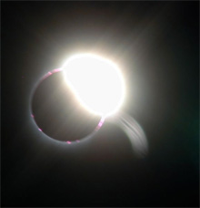
Image after Better Bloom
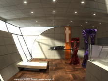
Image after Corona

|
|
| Applying Virtual Darkroom |
Virtual Darkroom is, in short, an advanced tone mapping utility that allows you to simulate existing and fantastical image in and output responses based on chemical film techniques. It is not limited to real world values and its application is virtually limitless. However, it is difficult to understand all that is going on within virtual Darkroom and this proves to be a hurdle for people to use it. This need not be the case once you understand the correct way of using it and the work flow in which this all takes place.
An important thing to know is that Virtual Darkroom calculates everything in HDR space. Most users fire up a standard render and try Virtual darkroom on it with one of the presets and conclude the results are way too dark or washed out to be useable. Little do they know they are only inches away from using a very powerful tool.
I use Virtual Darkroom to give real atmosphere and depth to my animations and stills. VD does things you would take hours upon hours in photoshop to do, and then you still need to know what you're doing. VD is a wonderful creative tool that I don't think any other render application has. |
On with the show
Add
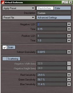
Virtual Darkroom the same way you add the HDR expose filter in the processing tab. Its interface looks like the image on the right.
The most important parts of VD are the preset selection and the negative and positive settings, the granularity setting and the color sensitivity settings. The presets cover 99% of all the users you might want and I've never needed anything else. The default preset is a black and white one though which proves to be reasonably useless for most applications. (see image on the right).
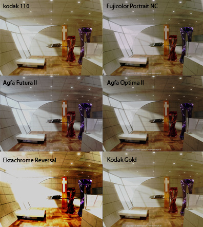
I want a nice warm chemical film look but not too distorted image. The workflow I use is by sifting through the presets to find one that remotely looks like what I want. Below several unaltered outputs using different presets. I turned the grain off for these.
The reversal film is showing what could be expected from a reversal film: contrast, bright saturated colors and sharp highlights. There's a whole range to work from in the presets. For this I'll choose the Kodak Gold as it isn't as sharp as the reversal but is still warm and colorful. However it is too bland and we're missing some white range as well as some blue channel that we want back. We want a warm image but not an old image.
So, the next thing we do is adjust the color sensitivity values. Changing the negative LUX or time upward will make the image brighter (equal to the exposure of the chamical film at the moment of taking the photograph). Changing the positive lux or time upward will darken the image (equal to increasing the time of exposure of the chamical photo papaer under an enlarger). I'm not going to mess too much with this as we can solve this later with another HDR expose. I want the right color balance for now. So, I change the red sensitivity to 90% (from 100%) and the blue from 3% to 4%. that will do for now.
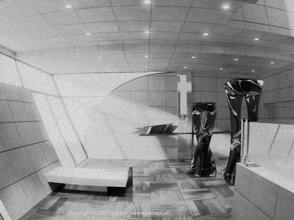
Our image is still washed out (see image to the right). So, we'll add another HDR expose in the stack instead of trying to figure out which negative and positive values to use... since I find it tedious and unpleasant.
|
Result after just adding
the Virtual Darkroom filter

Result after Kodak Gold
and color adjustments
|
To get the values to use in the last HDR expose filter, just double click the image an play with the image controls in the image viewer. This gives direct feedback and gets you where you want to be fast. I like the look of the image at a setting of 0.8 white point and 140% black point. So, I clode the image editor and enter those in my HDR expose, or I save it using the 'save exposed' function if it's just a still. And voila, you are done.
Sometimes it is nice to have a bit of film grain in the image. It gives it that touch of realism. I usually use a lower value than standard (0.0015), like 0.0005. Increasing the scattering dimensions will also reduce the film grain.
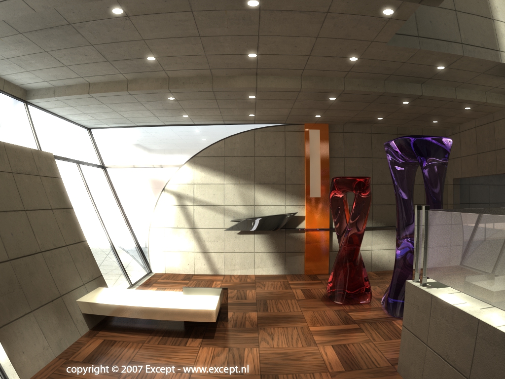
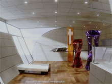
Below is the final image of this guide. Of course your specific application will require different settings. The power of this workflow lies in the adjustments of the HDr expose before and after the virtual darkroom. The bloom should be applied after the first HDR expose and before the VD. Applying the bloom after the VD filter gives unnatural results. One of the interesting things you might have observed is that after the initial application of the HDR expose, and certainly after the bloom, the outside terrace surface was completely blown out. However with the tone mapping of Virtual Darkroom it has been brought back even though it seemed to have disappeared. It's one of the powers of using HDR imaging to be able to do this.
I hope you'll have fun and hours of experimentation with this, and finally get rid of that synthetic CG look of your images. Perhaps in time you'll be ready to define your own color curve values in the advanced sections of VD, but for most applications that's not neccesary. Remember, if you have enjoyed this guide, to support us to make more of them (see below).
|
|
| Links & other tutorials |
If this tutorial proves especially handy for you, would like to support the creation of more of these tutorials and new developments, or would just like to express your thanks, you can make a donation by clicking on the following button, or alternatively just send me an email.
Go To Presentation Resources page
Go to Except Website
This guide is Copyright 2008 Except Design, and written by Tom Bosschaert. Nothing from this website can be copied, transferred, published or distributed in any way without prior written consent from the author.
|
|